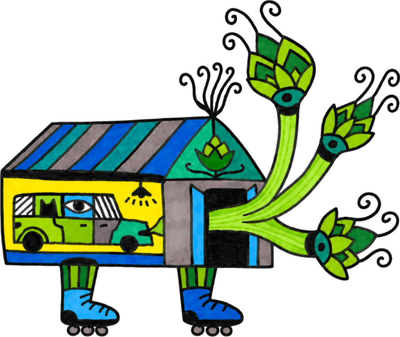
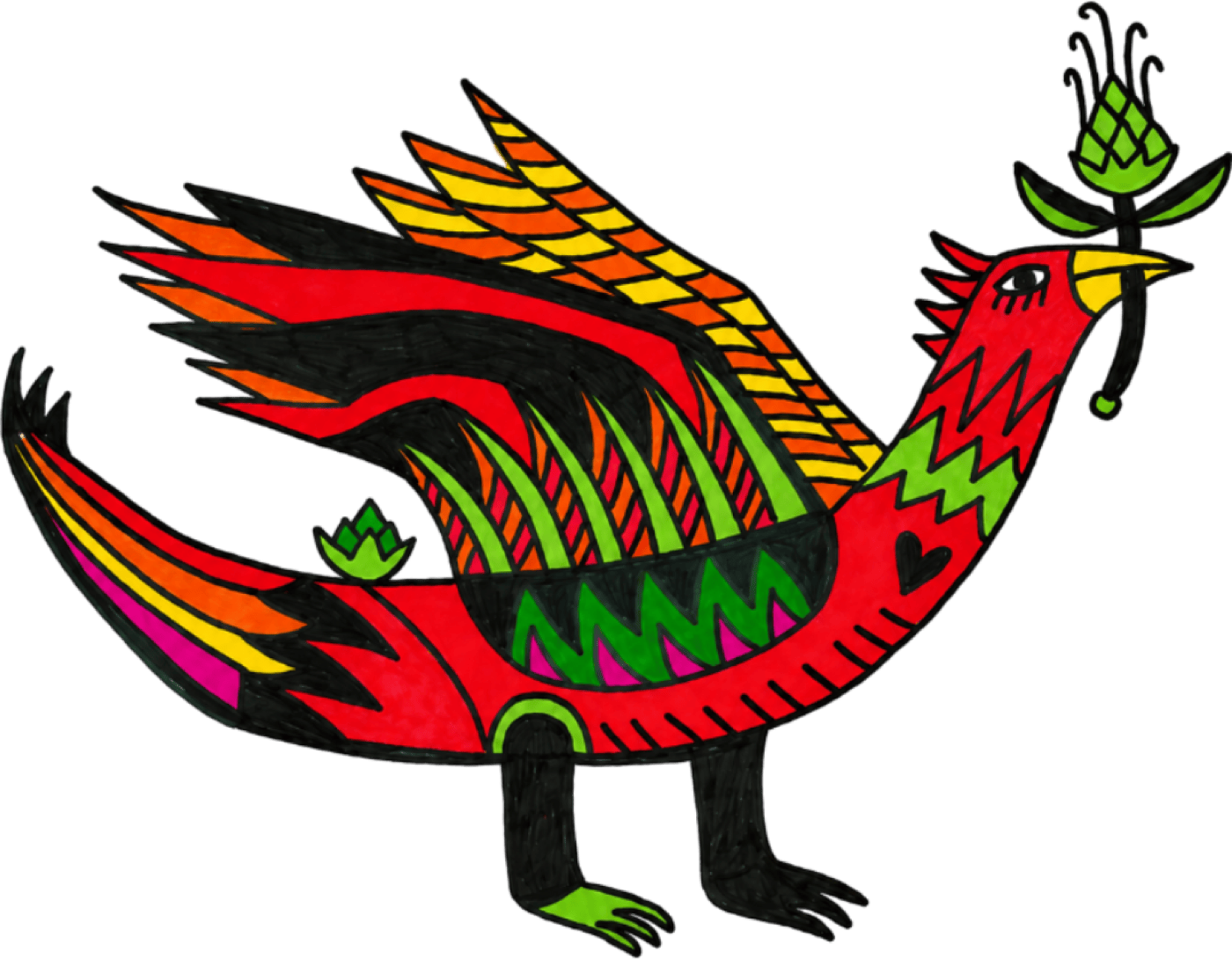
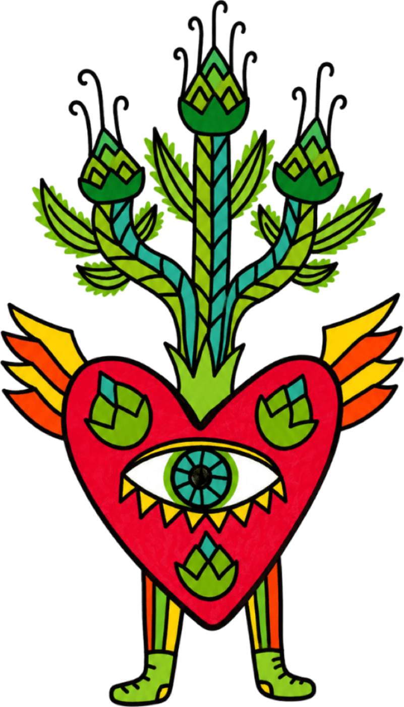
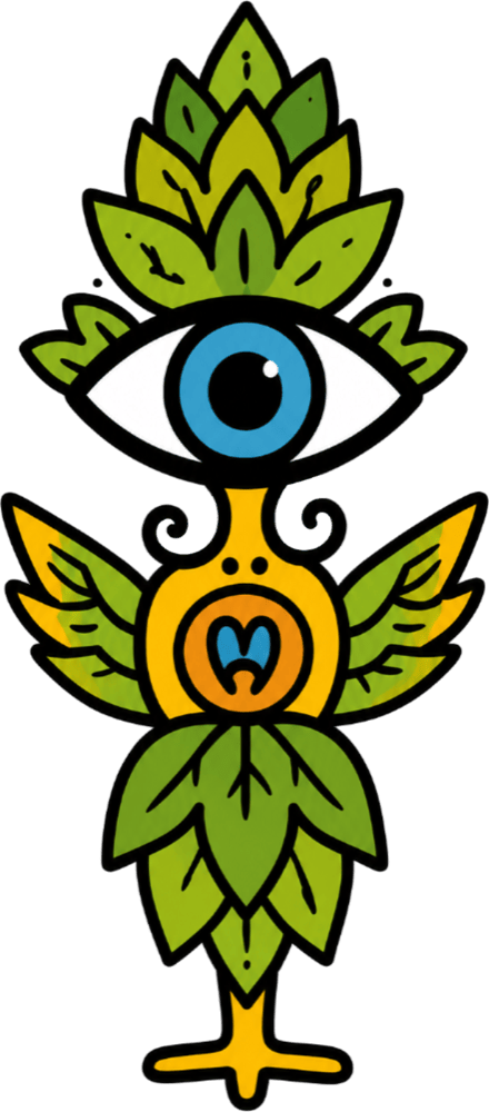
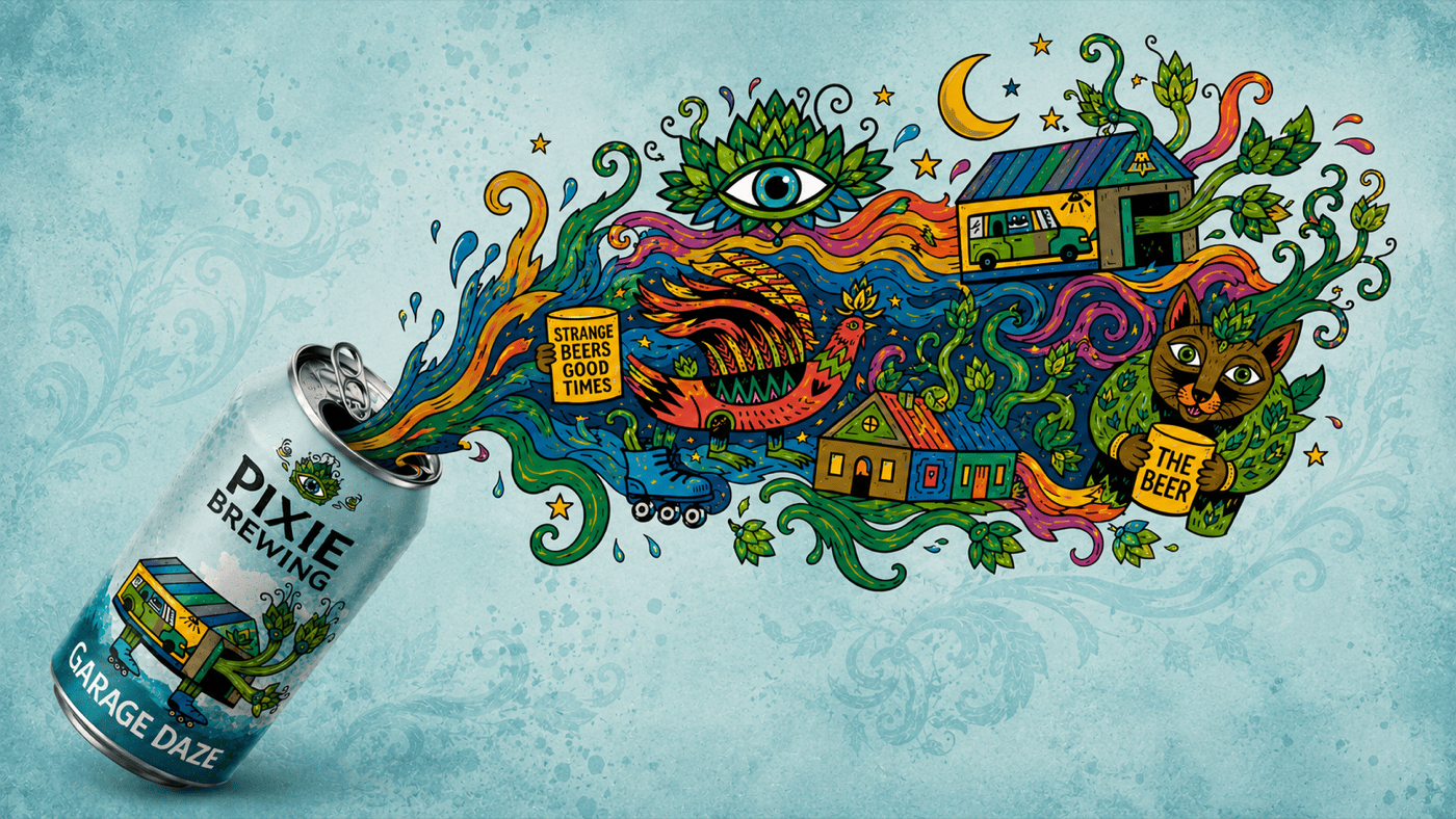
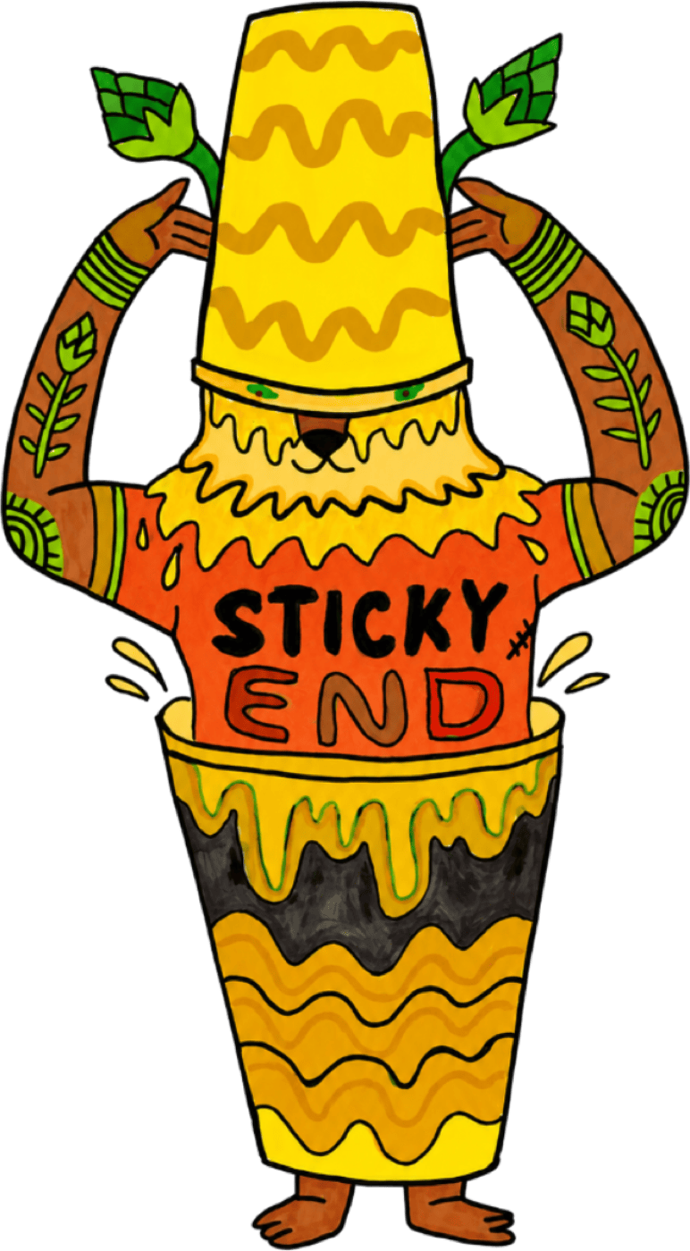
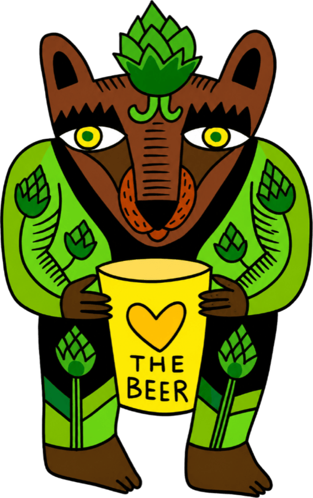
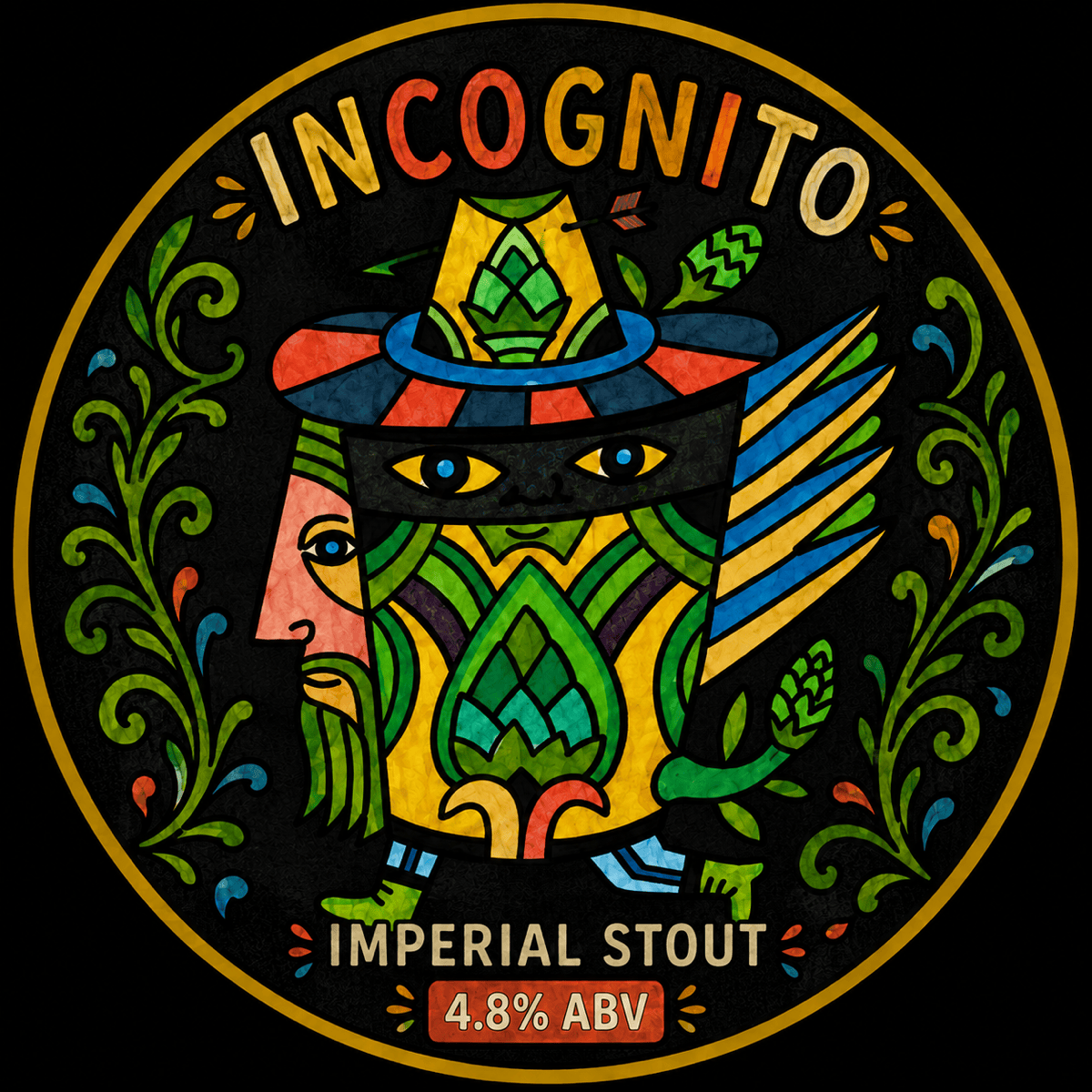
§ The universe, on one page
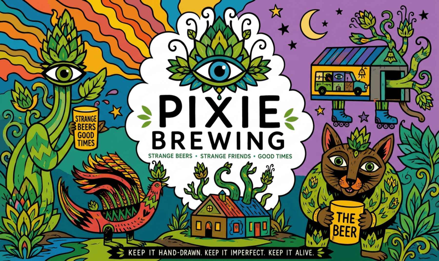
Strange beers. Strange friends. Good times.
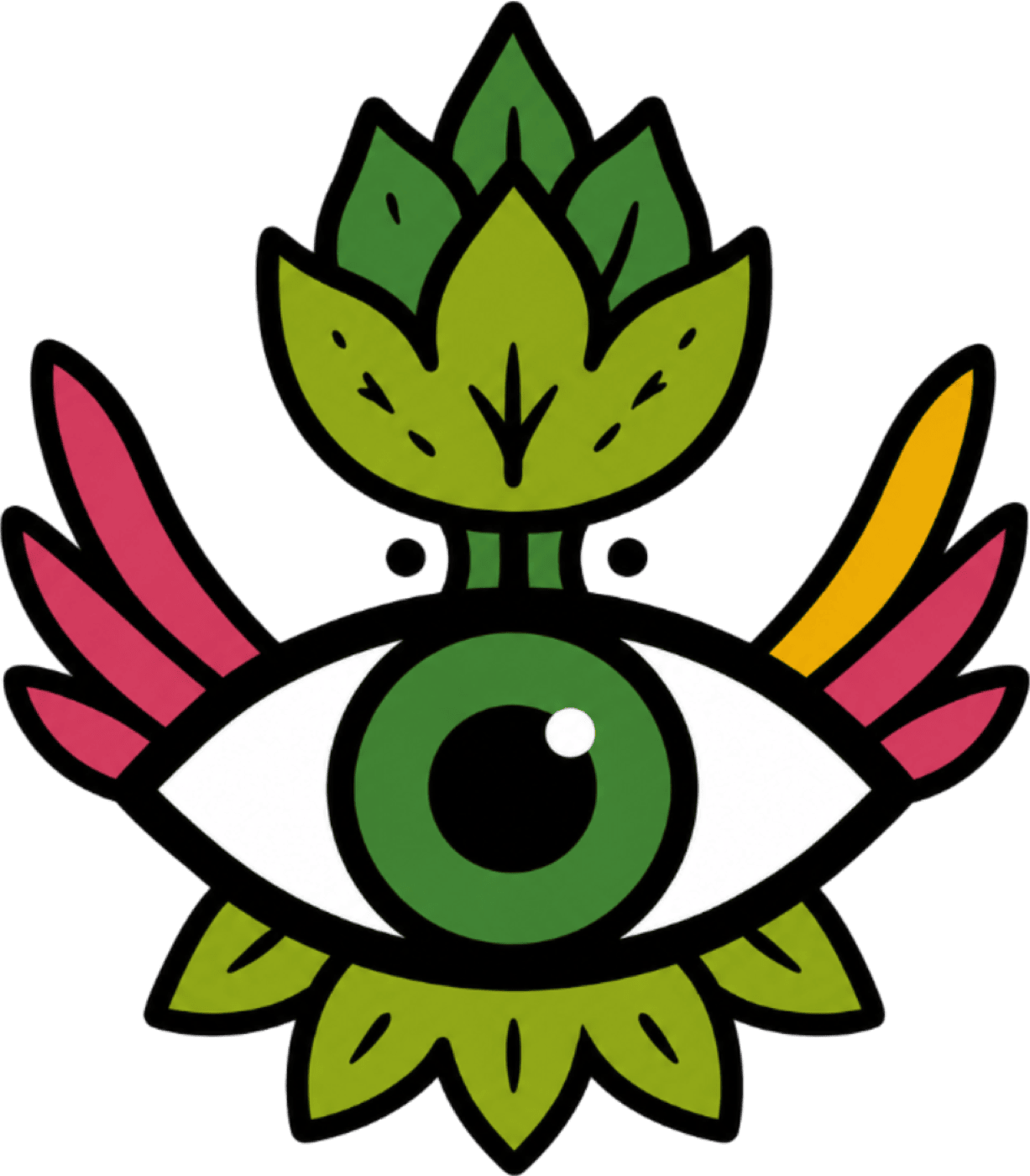
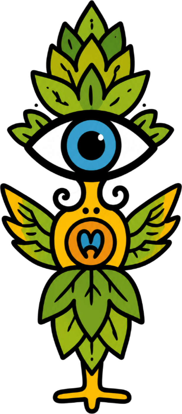
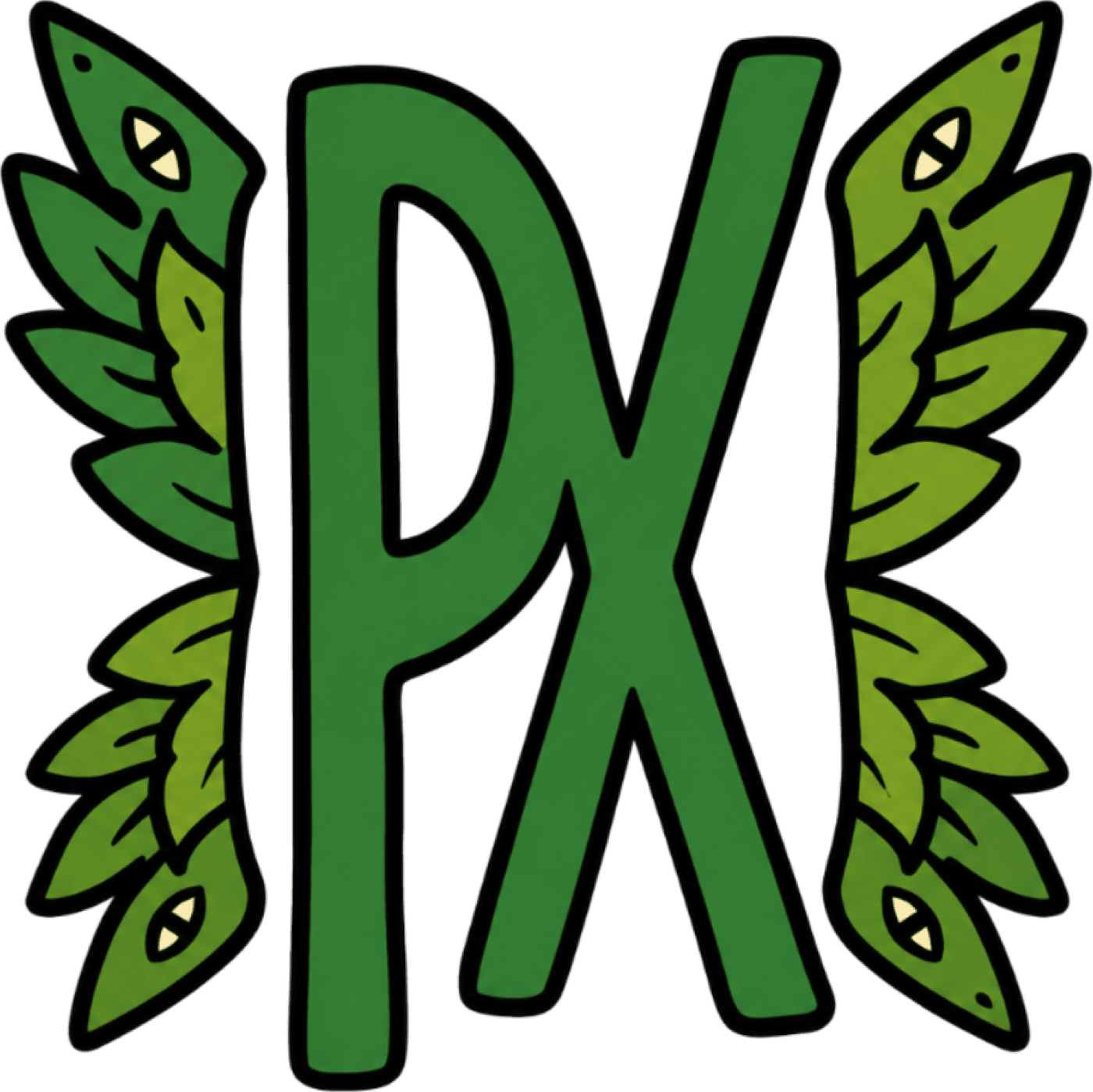
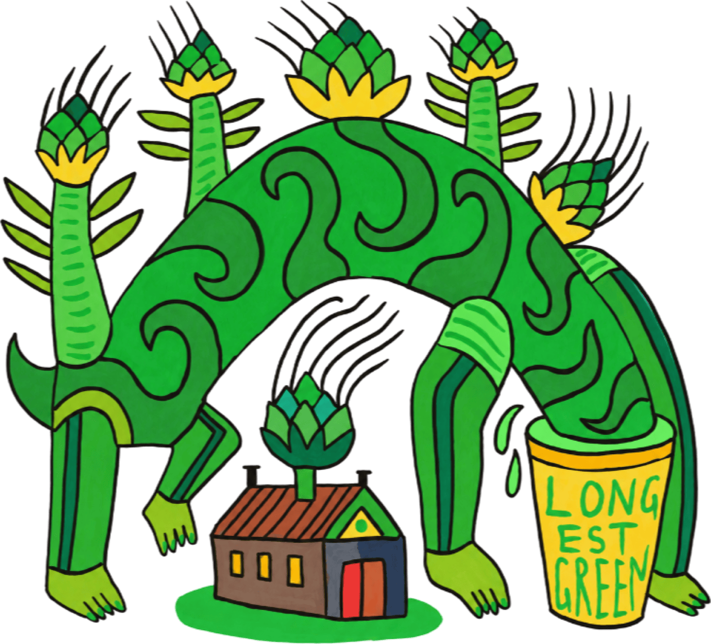
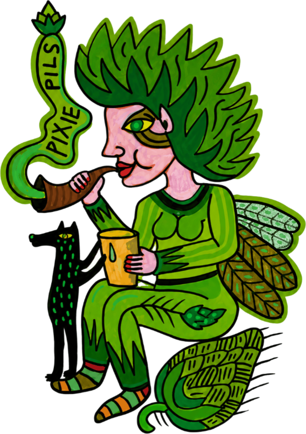
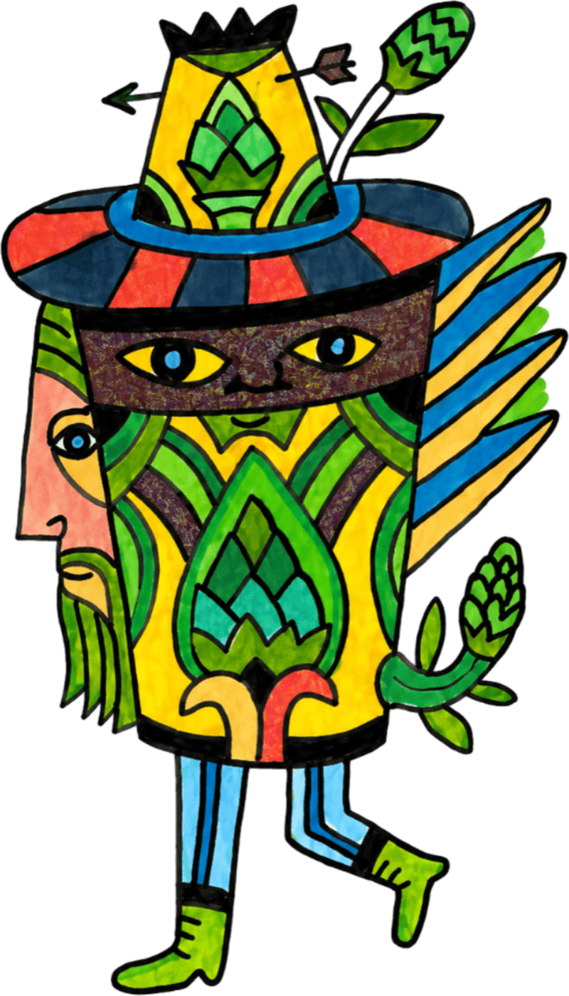
A single key visual built from the whole cast — wordmark anchored in white, every character orbiting. This is the brand condensed into one frame, and the blueprint we worked back from.