§ 01 — The Thesis
A podcast that behaves like a print magazine.
Editorial object · not a YouTube tile
Built to be kept, not scrolled past
Built to be kept, not scrolled past
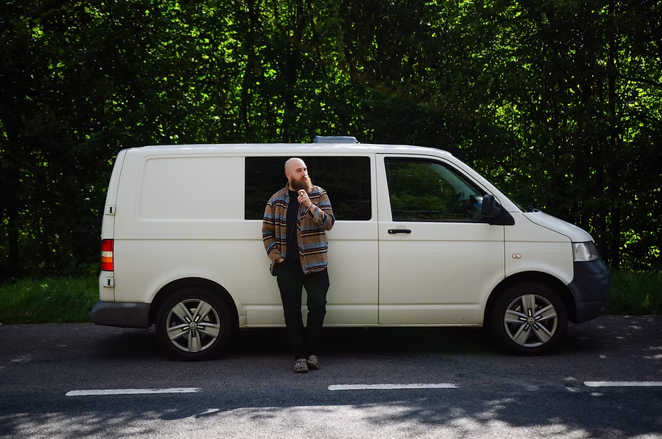
Fig. 01 — Establishing texture · visual ground
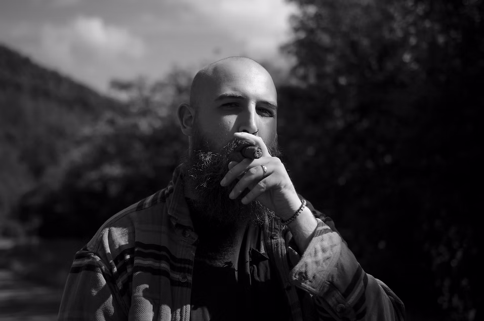
Photography · D&M